
01-23
至翔 NID 空 间 设 计
ZX NID space design
Hard installation design
/
Soft installation design
感谢您关注至翔NID空间设计
Thank you for your attention to ZX NID design
Hard installation design & soft installation design
ZX NID design team
Changshu,Suzhou,China
2024

项目名称 | Name :TOPTRUMP王牌珠宝
项目坐标 | Address :苏州 .常熟
项目风格 | Style :轻复古
设计机构 | Design :至翔NID空间设计
施工单位 | Consturuction :至翔精筑
设计时间 | Design time :2023·06
拍摄时间 | Shooting time :2023·10
项目面积 | Area :120㎡
摄影机构 | Photography :AK空间摄影

至翔NID空间设计
「 Design & Appeal | 设计&诉求 」
本案是一家隐藏在CBD的小型珠宝会所,采用全球名贵彩色宝石供应商,苏州地区的第二家店。TOPTRUMP成立以来,凭借其 新颖 潮流 炫酷和个性十足的设计,以及精致细腻的工艺在彩色珠宝领域成为了时尚界的新宠儿。
而把原石变成宝石,也是空间设计师的价值所在。接触业主之初,当时已经有设计方案了,业主总觉得效果还不够完美。找到至翔NID空间设计,经过设计师沟通和定位的梳理,彻底颠覆原方案。优雅的轻复古主题,更体现行业属性,空间设计和珠宝原创,相辅相成,互相促进。
本案是挑高的户型,空间不大,有遮挡,有错落,复古元素减法处理,化繁为简,大量采用弧形,柔和的处理手法,搭配深邃的普鲁士蓝和纯白,辨识度极高。
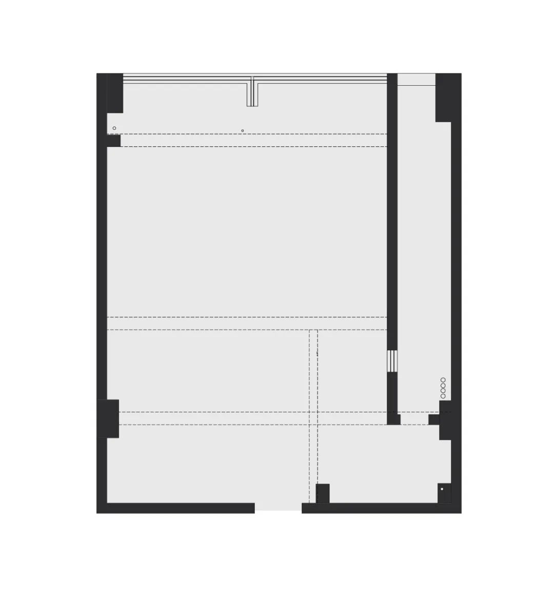
原始结构图
01.
Hall
Design agency: Zhi Xiang NID space design
门厅

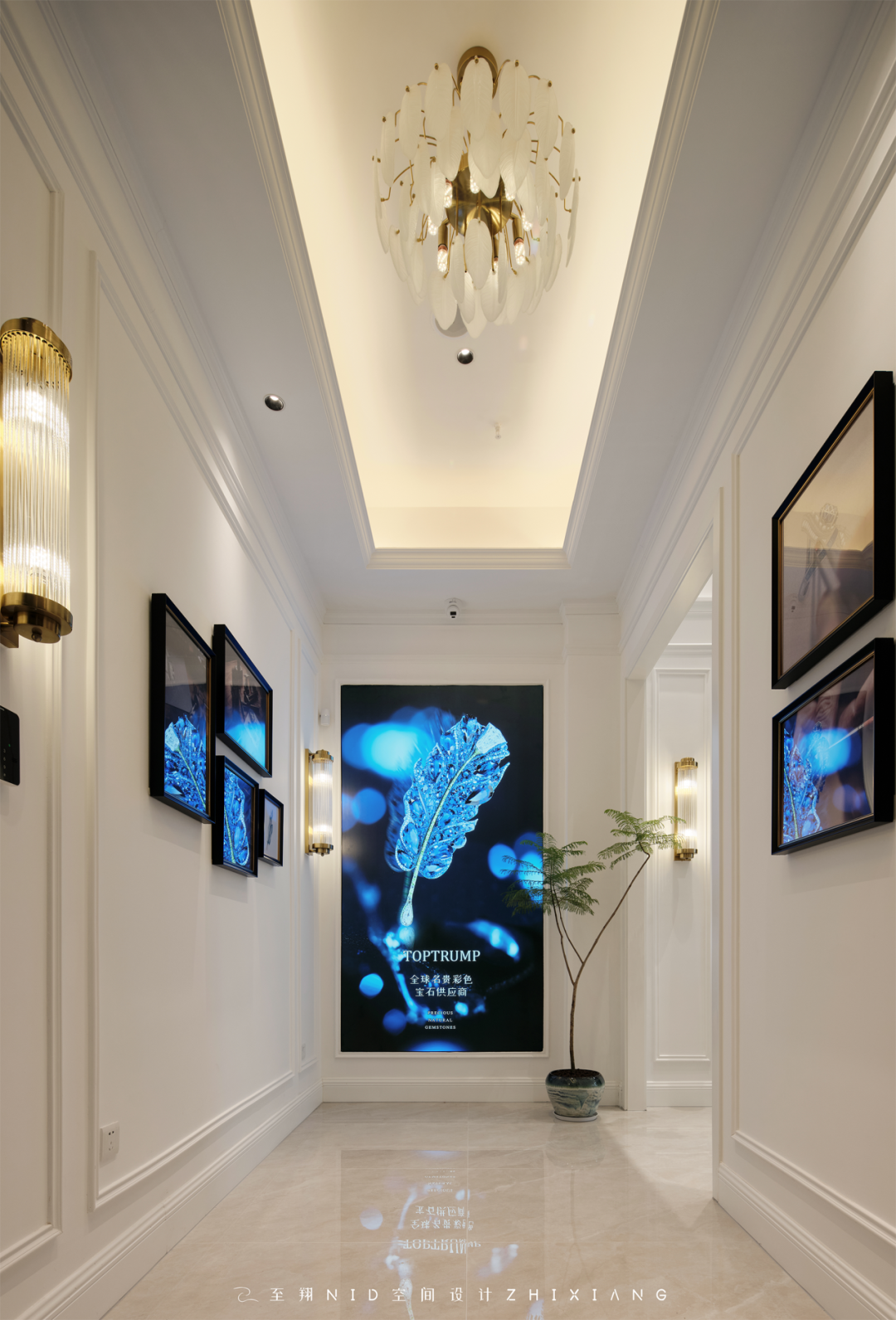
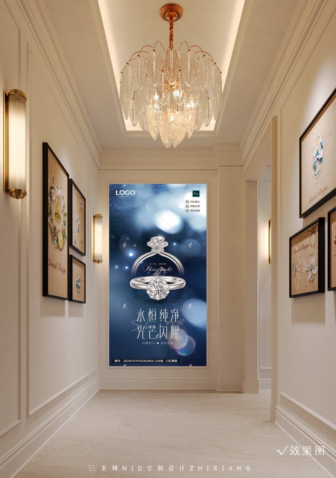
门厅是对空间的第一印象,有品牌形象,有文化宣传。展示了一些珠宝的工艺、从设计、加工工序、描绘一件定制珠宝的诞生。
The foyer is the first impression of the case, with brand image and cultural publicity. It shows some of the craftsmanship of jewelry, from design to processing, depicting the birth of a custom jewelry.
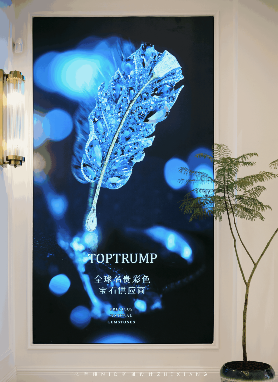
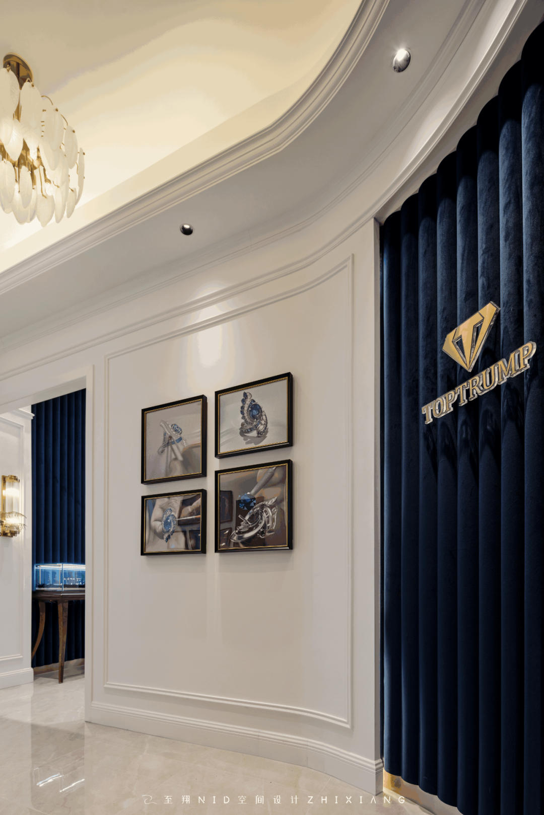
墙面装饰的挂画,采用往年优秀案例、获奖作品、处处体现原创的魅力。小户型避免一眼看到全貌,门厅划分一个独立区域,曲径通幽,进入展示区域。
Wall decoration hanging pictures, the use of previous years excellent cases, award-winning works, everywhere reflects the charm of the original. The small apartment avoids seeing the whole picture at a glance, and the foyer is divided into a separate area, and the winding path leads to the display area.
02.
Exhibition area
Design agency: Zhi Xiang NID space design
展示区
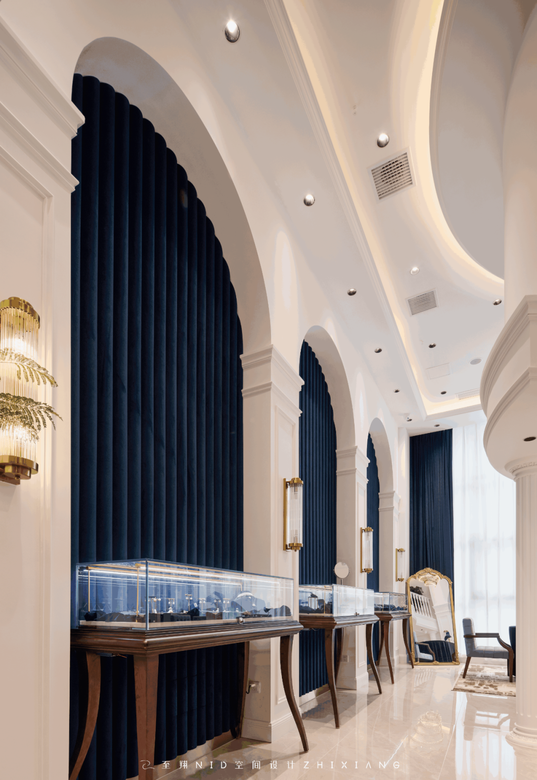
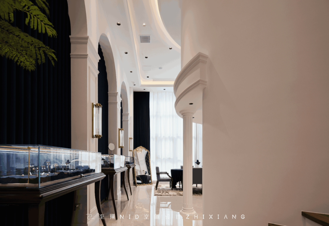
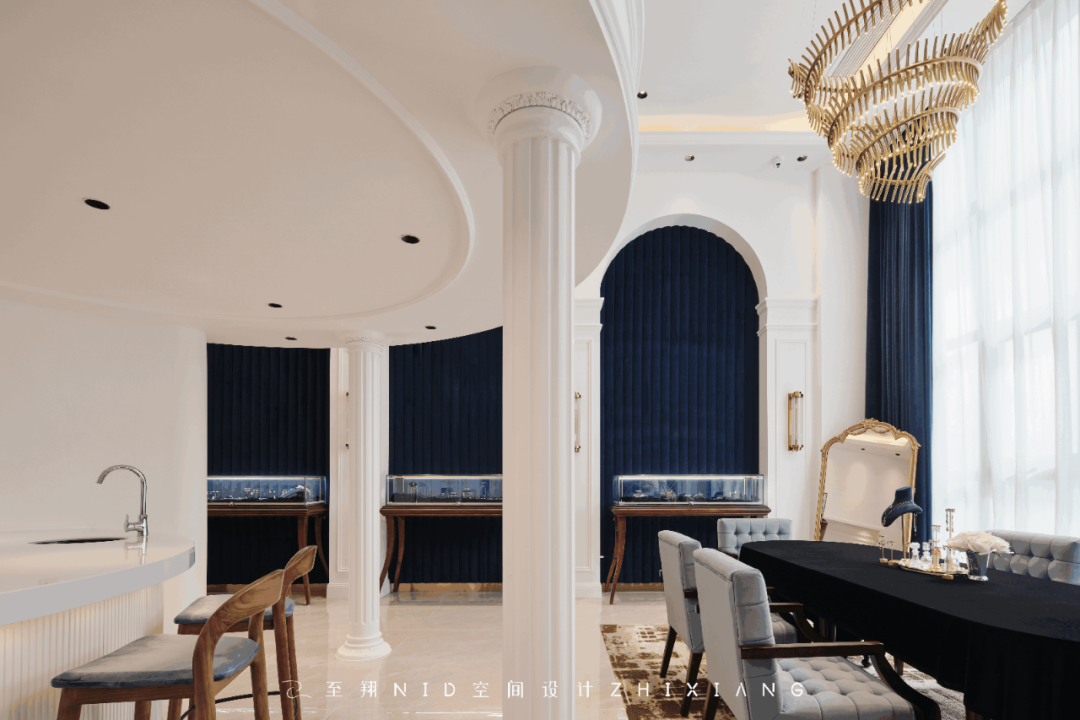
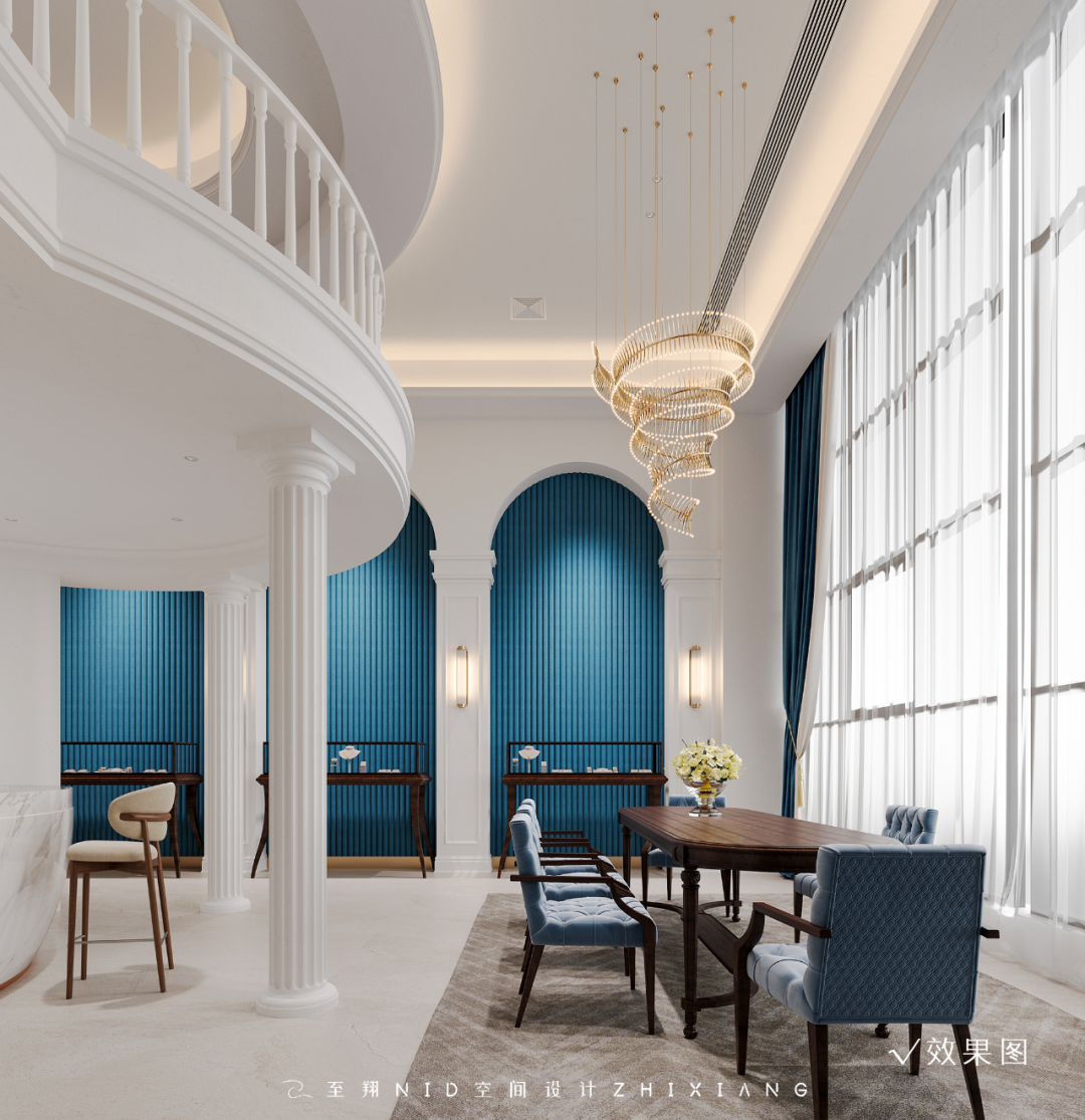
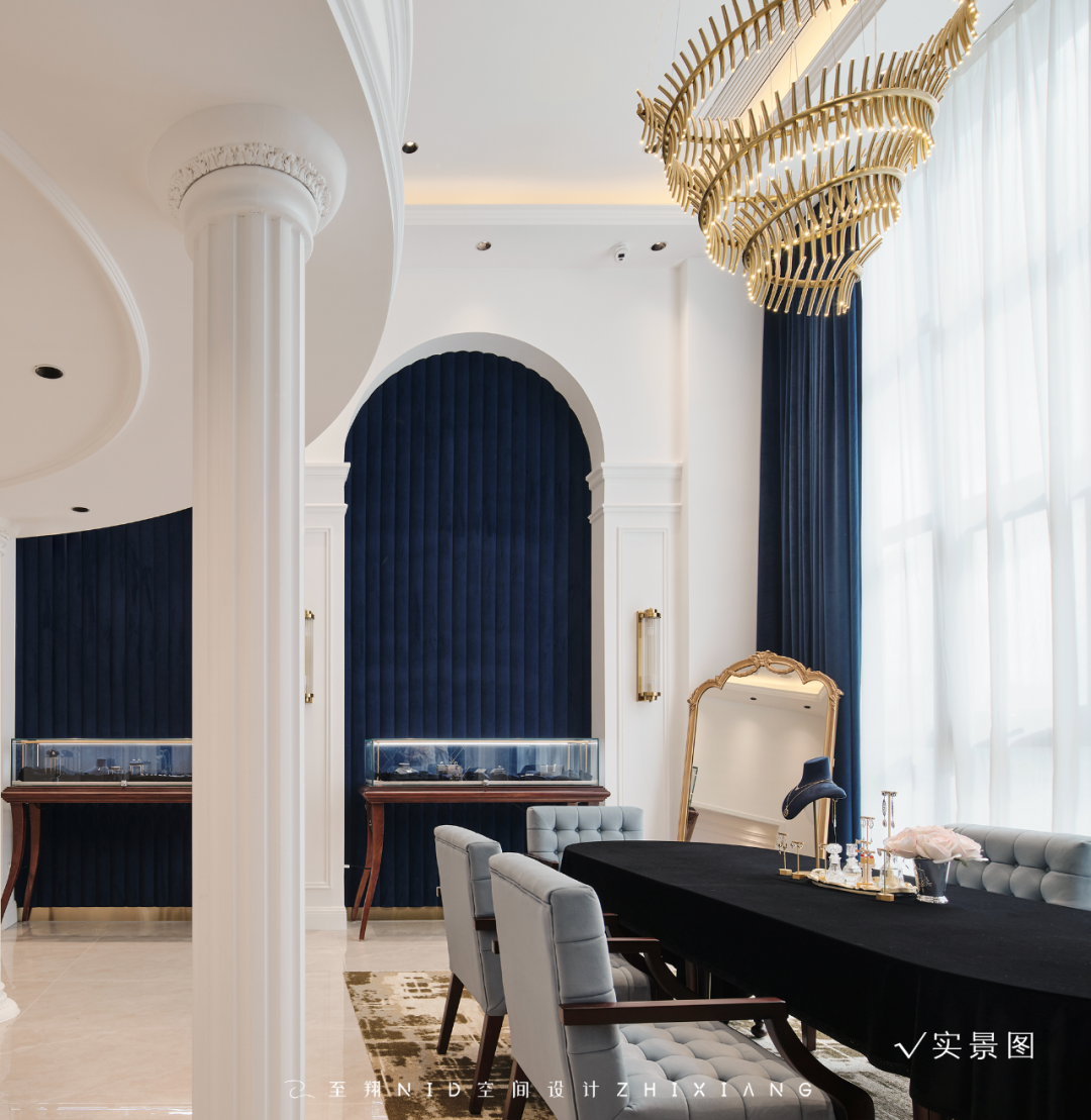
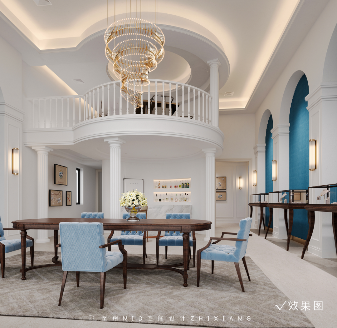
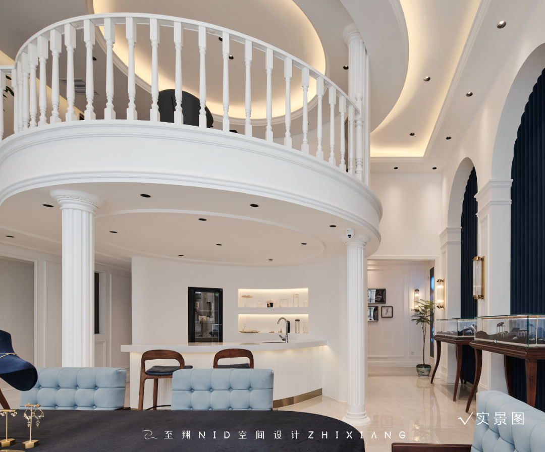
展示区是空间中心且重点体现的区域。充分利用挑高空间的气势,优雅的曲线、拱形是本案造型设计的精髓,搭配普鲁士蓝+纯白的主题色。
The exhibition area is the center and focus of the space. Make full use of the momentum of the high space, elegant curves, arches are the essence of the design of this case, with Prussian blue + pure white theme color.
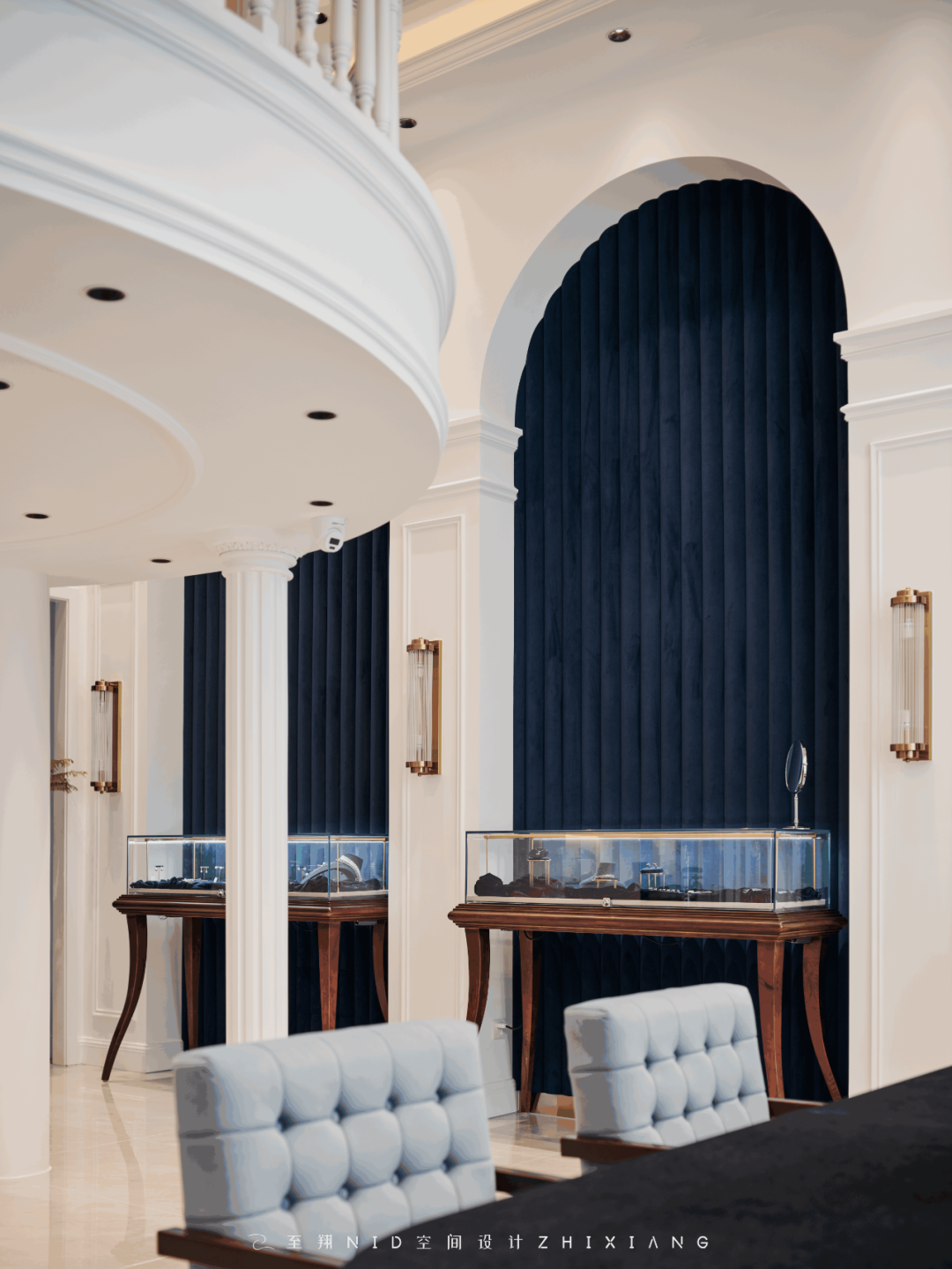
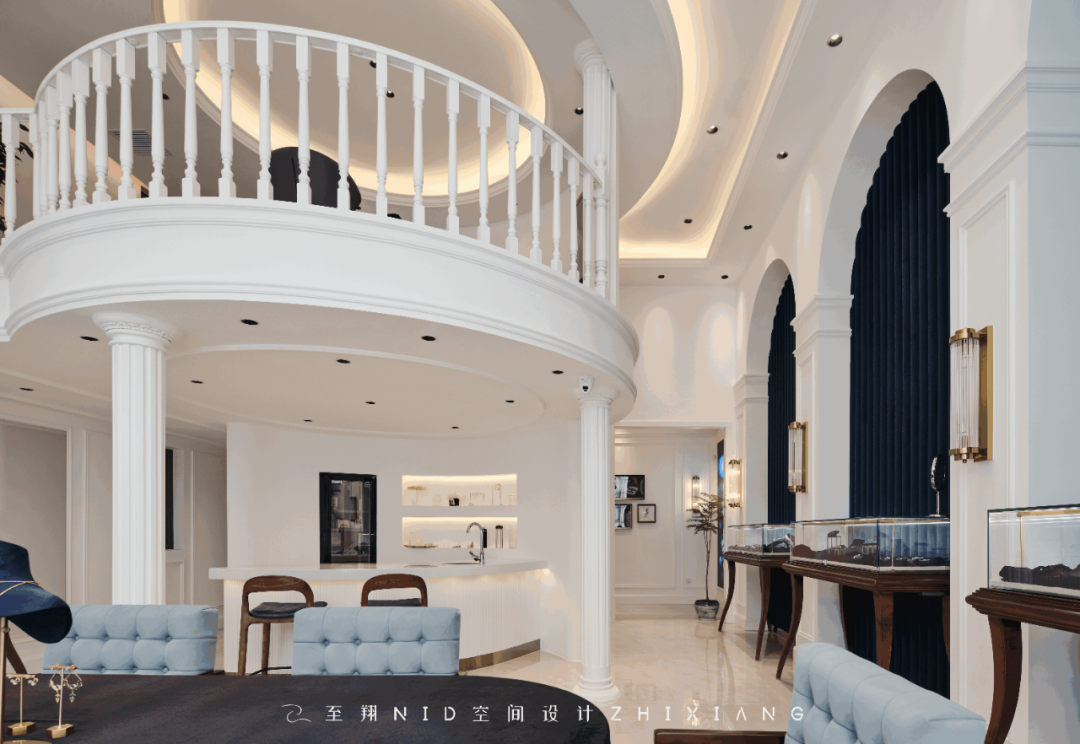
展示柜为满足轻复古风格的搭配,按设计方案,采用原木量身定制,精工细作和珠宝的名贵华丽相匹配。
In order to meet the matching of light retro style, the display cabinet is tailored to logs according to the design scheme, and the fine workmanship matches the precious and gorgeous jewelry.
03.
Tasting area
Design agency: Zhi Xiang NID space design
品鉴区
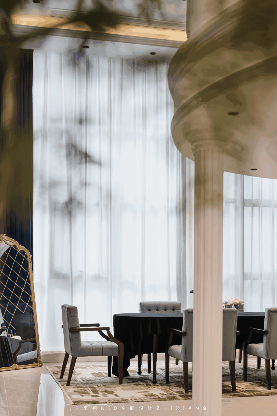
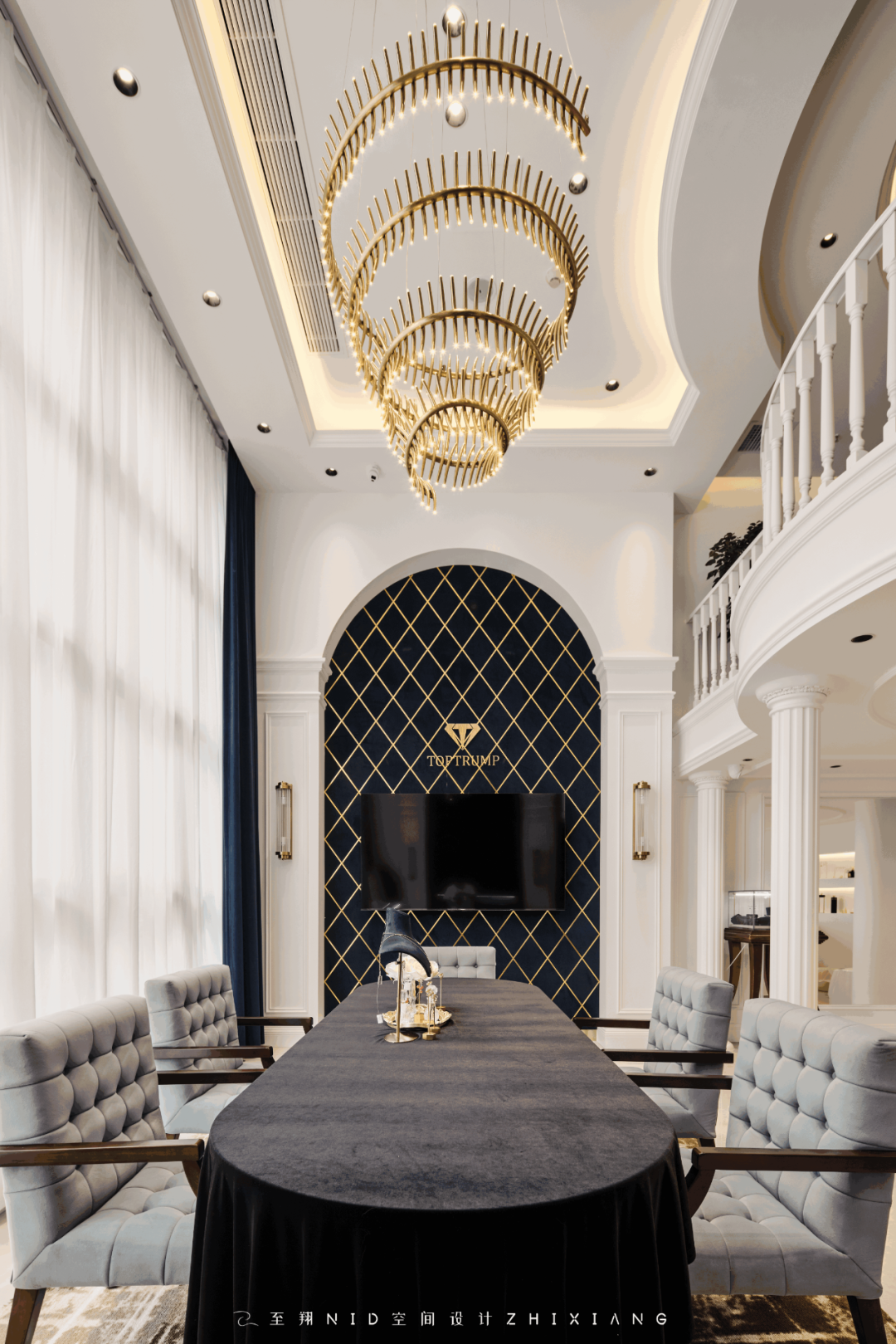
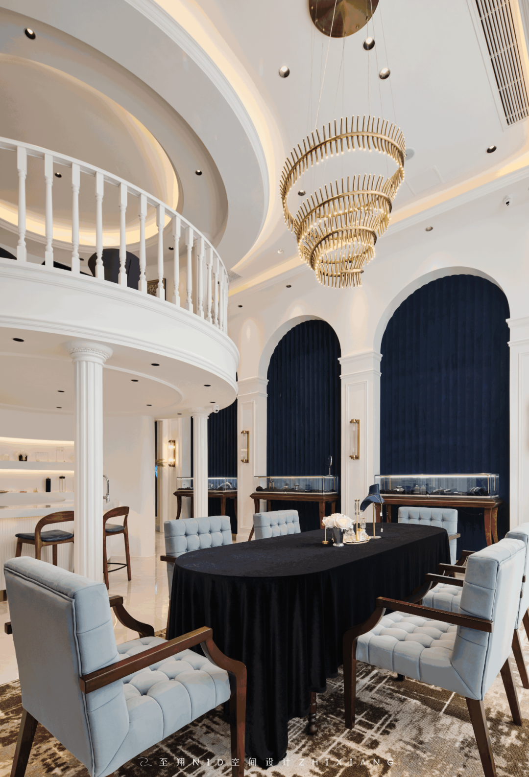
品鉴区衔接展示区,原户型两间打通,统一了大型落地窗,形成整体,空间最舒服的一个地方。品鉴区作为本案的中心区域,用于洽谈、品鉴、也可作为小型品鉴沙龙的活动场所。
The tasting area connects to the exhibition area, and the original two rooms are opened up to unify the large floor-to-ceiling Windows, forming the whole and the most comfortable place in the space. As the central area of the case, the tasting area is used for negotiation, tasting, and can also be used as a venue for small tasting salons.
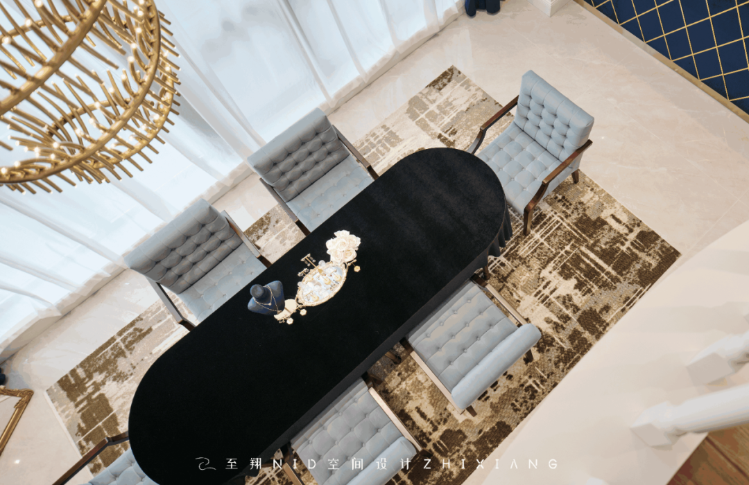

设计之初,充分考虑以后的使用功能及场景。在设计还原的过程中,家具的定制一帆风顺,吊灯定制一波三折,前期接触的厂家拒绝了生产,工艺相对复杂,最终还是有厂家有生产能力的,详细对接尺寸、工艺要求,完美还原落地。
At the beginning of the design, fully consider the future use of functions and scenarios. In the process of design restoration, the customization of furniture is smooth, the customization of chandelier is twists and turns, the early contact manufacturers rejected the production, the process is relatively complex, and finally there are manufacturers with production capacity, detailed docking size, process requirements, perfect restoration of the landing.
04.
Water bar
Design agency: Zhi Xiang NID space design
水吧
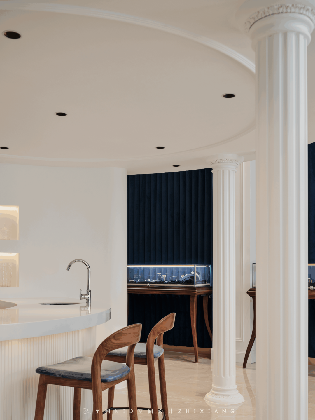

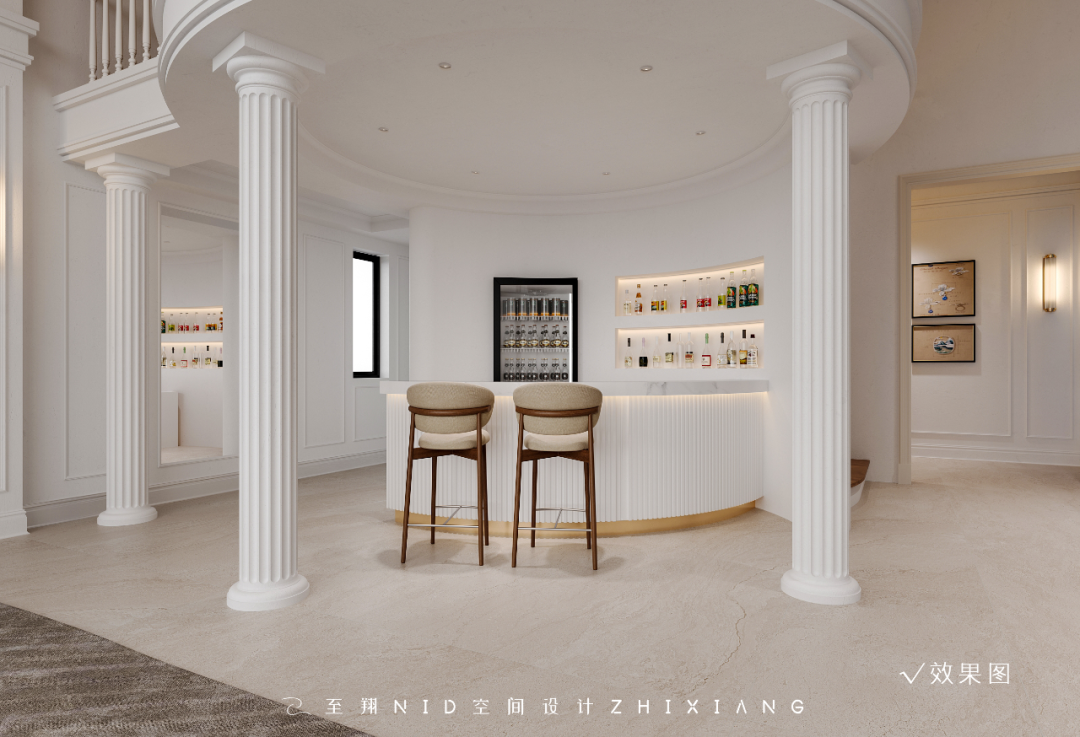
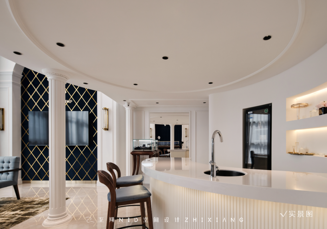
附属功能区域搭配平时的招待、茶水、等候功能。位于阁楼下方,层高有所受限,由于周围挑高,倒不显得压抑,左侧过道后面,还有卫生间、储藏室等附属功能,满足功能使用为主。
The auxiliary function area is equipped with the usual reception, tea and waiting functions. Located below the attic, the height of the floor is limited, because of the surrounding height, it does not appear depressed, behind the left aisle, there are toilets, storage rooms and other ancillary functions, to meet the main function of use.
05.
Attic
Design agency: Zhi Xiang NID space design
阁楼
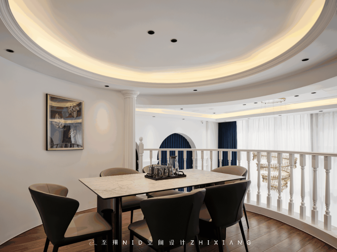
本户型是一个挑高空间,圆形阁楼一方面利用空间,另一方面作为方案最重要的一种造型装饰,造就了空间的高低错落,让空间灵动,每个视角都感受丰富。
This apartment type is a tall space, the circular attic on the one hand, the use of space, on the other hand, as one of the most important modeling decoration of the program, creating the height of the space, so that the space is smart, each perspective feels rich.
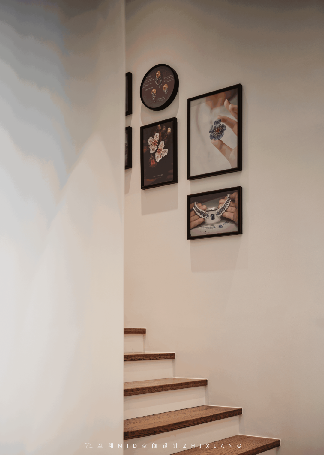
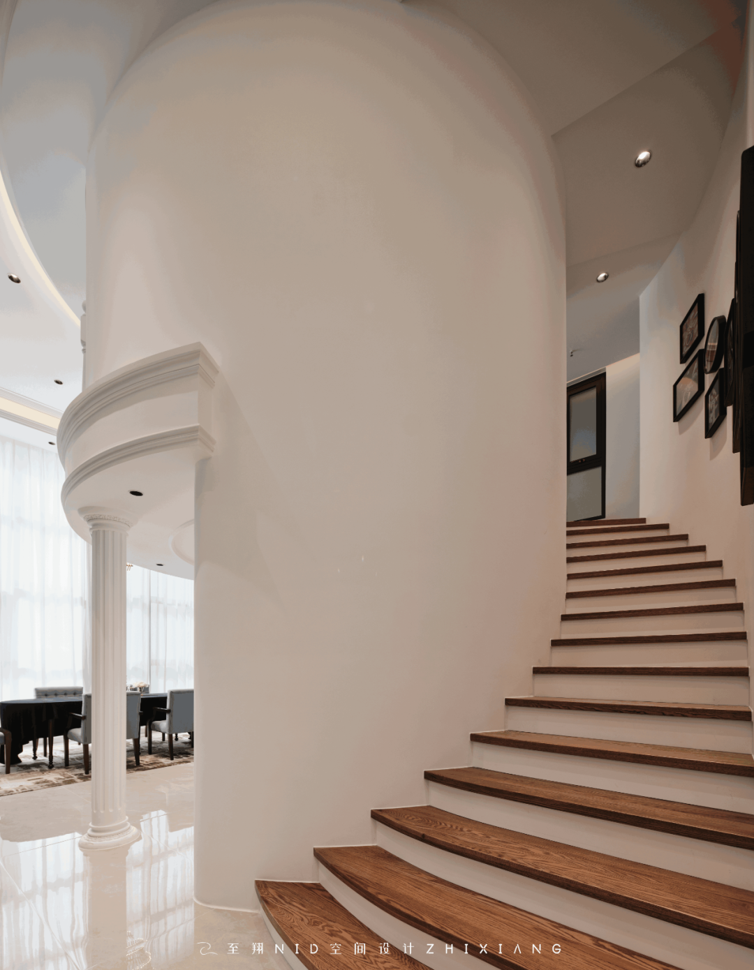
圆形楼梯墙面用作展示优秀作品。简单的会客区,作用可不小,同行的客人,在此喝杯茶,休闲一下,等候期间就不会尴尬了。
The circular staircase wall is used to display excellent works. Simple reception area, the role is not small, the guests of the same company, here to drink a cup of tea, leisure, waiting period will not be embarrassed.
实景效果图前后对比

-至翔NID空间设计-
